Introduction
Purpose of Huddo Analytics
Huddo Analytics provides an insight into the usage of your Connections environment with the help of graphical and tabular reports. It primarily focuses on providing information that directly addresses important user-adoption concerns. Answer questions such as - Which features are being used? How many users are using each feature? How is each feature being used? Which aspects of a feature need focus?
What is a Report?
A Report in Huddo Analytics presents a series of data pertaining to the usage of your Connections environment. There are several types of reports included in Huddo Analytics;
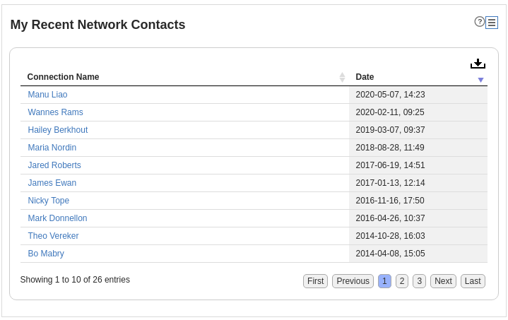
Table Reports
These reports show data in a tabular form, with the ability to sort and filter on column values and also to toggle entire columns.
Bar Charts
Bar charts are great for visual comparisons between values.
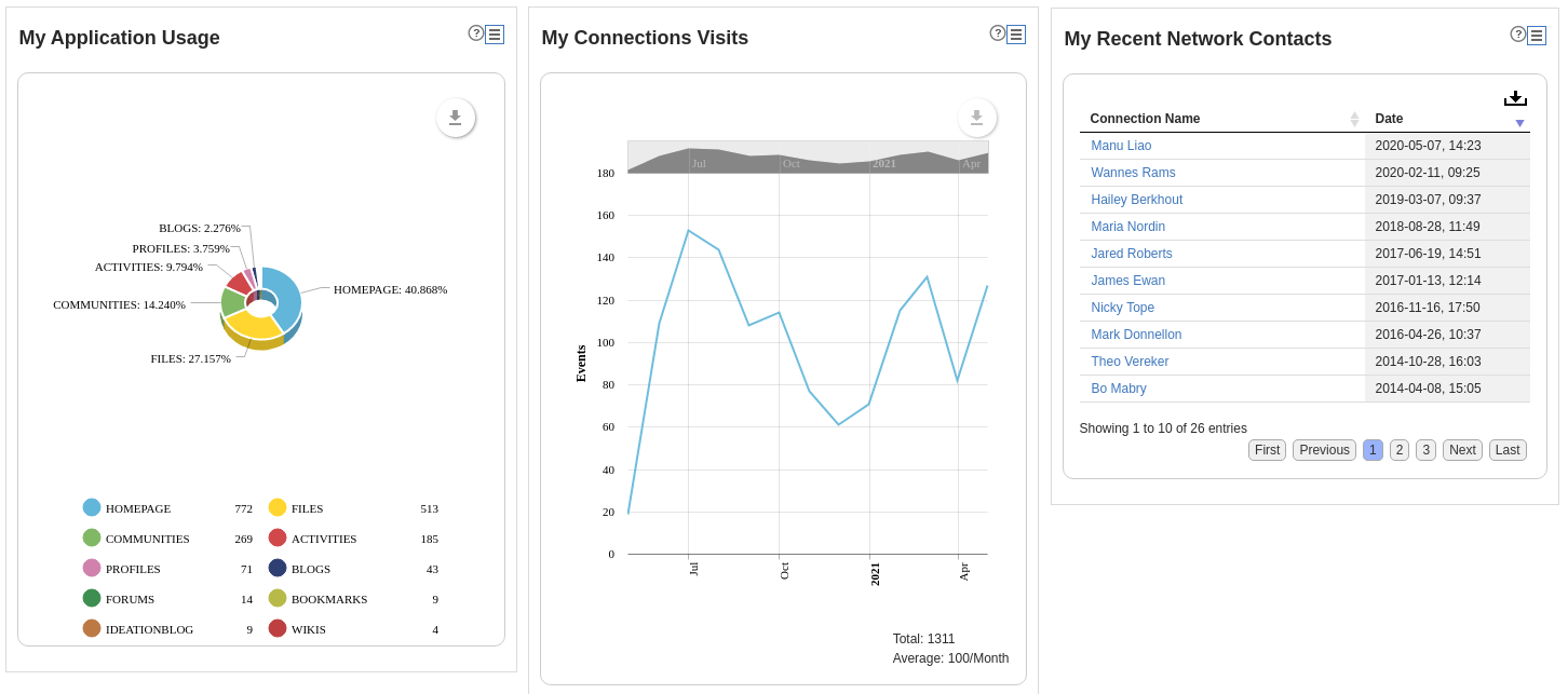
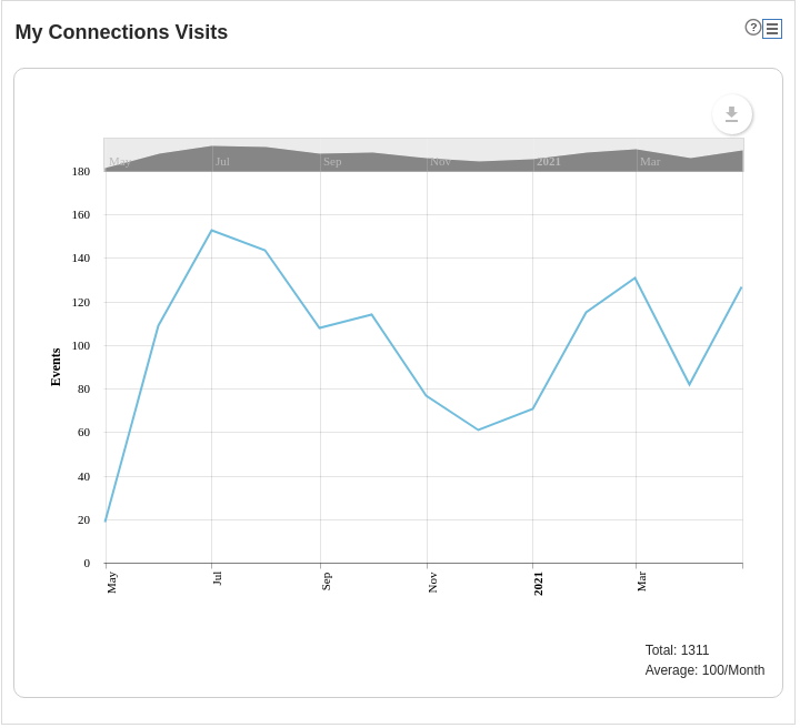
Trend Reports
These reports are used for showing values that change over time. They are a great tool for identifying usage trends over a period of time. They can be viewed as absolute or cumulative trends.
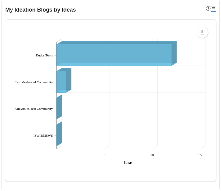
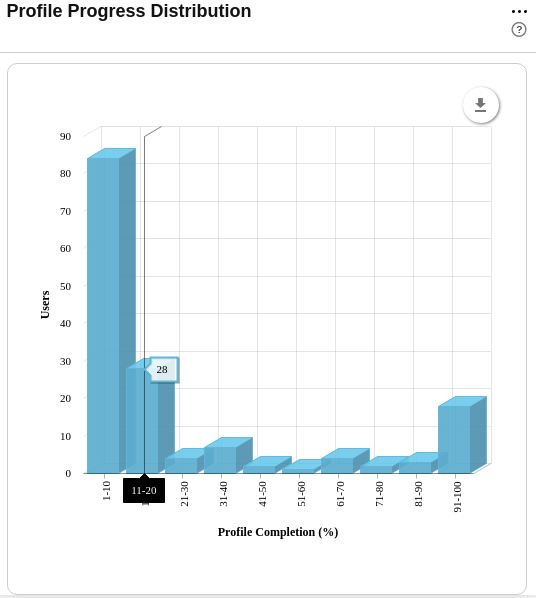
Column Charts
Column charts are great for representing a distribution.
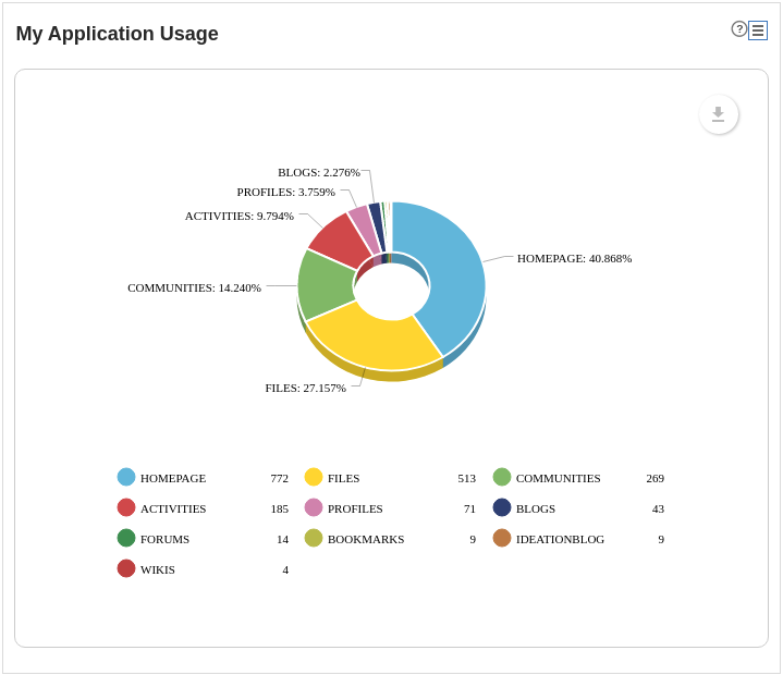
Pie Charts